An apparel product page has to do a decent amount of work. Shoppers need to compare colors and styles, understand how each option looks, and decide which size to order. It needs to provide as much of the in-person shopping experience as possible without making the page difficult to browse.
These decisions are closely connected. A shopper may find the color they want but leave because they are unsure about sizing. They may get a size recommendation and still hesitate because the gallery does not clearly show the color they selected.
Fit Quiz Size Recommender and Craftshift address both parts of the decision. Craftshift’s Rubik Variant Images & Swatch gives each variant its own product media and visual selection experience, while Fit Quiz provides product-specific recommendations for size, length, width, and fit.
Here is how apparel and footwear brands can use both to build a better Shopify product page.
Shopify products with several colors, materials, patterns, or styles can quickly end up with crowded image galleries. Shoppers may have to scroll through dozens of photos to find the ones connected to the option they selected.
Someone who selects navy should immediately see the navy product from the front, back, side, and close up. Images of the black, green, and red versions should not be mixed into the same gallery.
The Rubik Variant Images & Swatch app allows merchants to assign multiple images, videos, or 3D models to an individual variant. When a shopper makes a selection, the gallery updates to show the connected media.

For each important color or style, try to include:
The images do not need to be identical across every option, but the coverage should be consistent. If the black version has 8 detailed photos and the white version has 2, shoppers may assume the white product has something the brand does not want them to see.
It is also helpful to review the order in which the images appear. Start with the image most likely to confirm the shopper’s choice, then move through additional angles, fit, fabric, and detail shots. The goal is not to add as many images as possible. The gallery should answer the questions someone would normally ask if they could see and handle the product in person.
Shopify’s standard variant picker works, but a dropdown hides the available choices until someone opens it. Visual swatches make colors, patterns, and materials visible on the product page so shoppers can compare them immediately.
The right swatch depends on the product option. Solid color swatches work for straightforward shades such as black or navy, while image swatches are usually better for prints, washes, textures, finishes, and materials. Clickable text buttons work well for sizes and other text-based choices.
Rubik lets merchants mix these formats on the same product. A store could use image swatches for color, clickable buttons for size, and another set of images for material instead of forcing every option into the same type of picker.
Swatch labels should be easy to understand. A branded shade name such as Midnight Run may fit the collection, but shoppers may still need to know it is dark navy. Showing the shade name near the swatch gives the brand room to be creative without making shoppers guess.
Pay particular attention to how the swatches work on mobile. The selected option needs to be visually distinct, unavailable choices should be clearly marked, and each swatch needs to be large enough to tap without accidentally choosing the one next to it.
Merchants can adjust the shape, size, borders, spacing, alignment, labels, tooltips, and sold-out treatment. Rubik also includes keyboard navigation, screen reader labels, focus indicators, and reduced-motion support as part of its accessibility features.
Every swatch needs to open the correct images. Before publishing the page, select each option and confirm that the main image shows the chosen color or style, followed by the rest of the media assigned to that variant.
Products with color, size, and material options need additional testing to make sure each available combination displays the right media. Rubik supports products with multiple options and allows images to be assigned by variant combination. Merchants with larger catalogs can use bulk assignment or AI-assisted image matching instead of configuring every product individually.
Craftshift also offers free tools for reviewing product images across a catalog. Its Variant Image Coverage Checker identifies variants without their own images, while the Product Image Weight Checker finds oversized files that may slow down product pages.
Once shoppers choose a product and color, they still have to decide which size to order. A traditional size chart gives everyone the same measurements and leaves each shopper to interpret what those measurements mean for the product they are viewing.
Fit Quiz Size Recommender recommends a size for the individual item. It can account for differences between product types, size models, individual products, and the shopper’s fit preferences.
The Fit Quiz button should appear close to the size options, where someone deciding between 2 sizes will naturally look for help. Copy such as “Find my size” or “What’s my size?” makes the purpose of the button easy to understand.
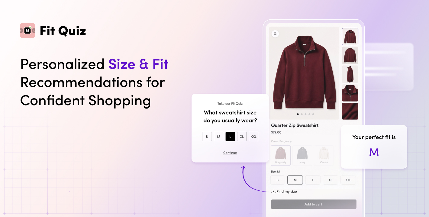
Avoid placing sizing help so far below the product information that shoppers have already made their decision or left the page. It should be available when they are looking at the size options, not after they have read the care instructions, shipping policy, and customer reviews.
Merchants can customize the colors, fonts, button styling, and placement to match the rest of the store. The button should stand out enough to be noticed without competing with the Add to Cart button.
Small, Medium, or Large is not an adequate guide to determine sizing on an ecommerce store. A pair of jeans may fit at the waist but be too long, while a shoe can be the correct numerical size but too narrow. A jacket may fit as designed but feel too oversized for someone who prefers a closer fit. There isn’t a one-size-fits-all in sizing.
Fit Quiz provides additional recommendations for length, width, and fit. These are useful for:
The product description should still explain how the item was designed to fit. Fit Quiz adds a personalized recommendation based on the shopper and the product they are considering.
This information should agree across the page. If the description calls a product oversized but the recommendation gives no indication of how that fit may feel, the shopper still has to figure out which source to trust. Product copy, model information, reviews, and sizing recommendations should be telling the same story.
Fit Quiz needs to know which sizing setup applies to each product. Shopify merchants manage this by mapping products to the appropriate product types and size models.
The Product Mapping table shows which products have Fit Quiz enabled and how they are configured. This is important for catalogs with several product types or sizing systems. This can be accomplished by using Shopify tags, types, product categories, product title search, or in a more automated fashion with Mapping Rules.
A dress should not use the same sizing setup as a shoe. A fitted blazer may need different settings from an oversized sweatshirt, even when both use familiar labels such as Small, Medium, and Large.
Merchants can automate the process using Mapping rules for new products using Shopify product data. They assign products to the appropriate gender, product type, and size model, reducing the amount of manual catalog maintenance and the chance of publishing new products without sizing assistance.
Review the mapping when you:
Shopify stores can automate mapping rules and include it as part of the launch checklist for seasonal collections. New products are often added quickly, sometimes by several people at once. A short review before launch is easier than discovering later that the sizing tool was missing or using the wrong setup on a high-traffic product.
Variant swatches should clearly show which options are unavailable. If the selected color is sold out in the shopper’s recommended size, the page should make that clear before the shopper reaches the cart.
Fit Quiz can capture email addresses when recommended sizes are unavailable and connect that information with Klaviyo back-in-stock flows. The brand can then contact the shopper when the size returns rather than relying on them to remember to check again.
The message should acknowledge the size the shopper wanted instead of dropping them into a general email list. If possible, the follow-up should take them back to the same product, color, and size so they do not have to repeat the selection process.
Out-of-stock reporting may also show where inventory is limiting sales. If shoppers repeatedly receive recommendations for unavailable sizes, the brand can use that information when making purchasing, merchandising, and replenishment decisions.
International shoppers should not see a translated product description followed by product options or sizing assistance in another language. Rubik’s visual swatches reduce some dependence on written color and material names, while Fit Quiz supports localized sizing experiences in multiple languages.
Review translations across the full product page, including:
A person should review brand-specific color names and technical fit terms. A direct translation may be technically correct and still mean very little to the shopper.
Sizing conventions need the same attention. A shopper moving between US, UK, and EU sizing should not have to guess which system appears in the recommendation or product selector. The labels and recommendations should match the market and the sizes the brand actually sells.
The apps should be tested together as part of the complete product page. Start with a product that has several colors, sizes, and images. Select every swatch, confirm the gallery updates correctly, complete the Fit Quiz, and make sure the recommendation matches an available Shopify variant.
Add the selected product, color, and size to the cart to confirm that all 3 carry through correctly. Repeat the process on mobile and look for swatches that are difficult to tap, option lists that take over the screen, images that appear in the wrong order, or sizing help positioned too far from the size selector.
Test more than 1 product. A simple T-shirt may work perfectly while a product with multiple colors, lengths, and materials exposes a setup problem. It is also worth testing a sold-out option and a newly added product instead of limiting the review to established bestsellers.
The final review should cover accessibility as well. Make sure keyboard users can navigate the swatches and screen readers announce option names and availability correctly.
The Fit Quiz Shopify Performance dashboard compares the behavior of shoppers who use Fit Quiz with those who do not. Depending on the store’s plan and available data, reporting may include engagement, conversion, sales, return behavior, and ROI.
For the full product page experience, monitor:
Look at these numbers by product where possible. A strong overall conversion rate can hide individual pages where shoppers are struggling with a crowded gallery, unclear swatches, or an unavailable run of sizes.
Conversion should not be the only measure of success. More orders are not much of a win if those products come back because shoppers selected the wrong variant or size. The stronger outcome is a purchase that the customer keeps.
Product images, swatches, and size recommendations solve different problems, but shoppers experience them as part of the same purchase decision.
Craftshift makes it easier to see and compare the available product options. Fit Quiz Size Recommender helps shoppers determine the right size, length, width, or fit.
Together, the 2 apps give apparel and footwear brands a practical way to improve product discovery and sizing confidence while giving shoppers a better chance of getting the product and fit right the first time.